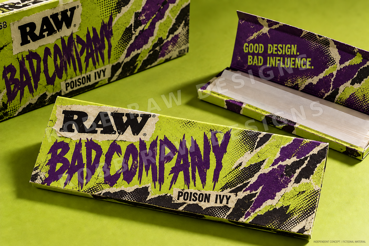
BAD COMPANY
GOOD DESIGN. BAD INFLUENCE.
Poison ivy (fictional) Fictional material study
ARTIST INTENT
“I wanted it to feel torn from a gig poster somebody tried to rip down. Three violent slashes, xerographic grit and a name that sounds like the start of a story.”
VISUAL DIRECTION
Adult punk collage makes poison ivy feel rebellious and collectable.
Chartreuse pack with violet torn-poster slashes, oversized typography and controlled xerographic textures.
PROPOSED FINISH
Torn-print texture. Violet layers. Chartreuse ground.
NEXT TEST
Build the collage as deliberate print artwork; verify the title and RAW mark remain readable at booklet scale.
PALETTE
Acid chartreuse / deep violet / black
INTERACTION STUDY
Peel back the attitude
Slide through three layers of poster collage.